EB GH
Showing posts with label Construction. Show all posts
Showing posts with label Construction. Show all posts
Thursday, 1 February 2018


Thursday, 28 December 2017
Magazine Final Changes
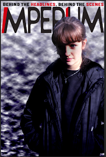
After my previous magazine draft that at the time I believed to be my final draft I decided to make a few small changes after receiving some audience feedback on my front cover.
The changes made were

The changes made were
- Moved the barcode to the bottom on the page
- Increased the size of the film title text
- Changed the 'ballantyne strikes again' text so it is no longer centre aligned
- split the price and issue number text and placed them on separate sides of my cover
- Moved the arrow at the bottom of the page slightly to the right so it covers the whole of the bottom on the magazine
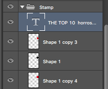
- Fixed the spelling of 'horrors' in my stamp
Here is my final Magazine front cover

E.B.
Saturday, 23 December 2017
Colour Grade - Rest of the Film
Hover over each image to see it before colour correction!
I'll let the photos mainly talk for themselves - I think the difference is surprising. I'll talk generally about what I did though:
I made the shots darker as the trailer went on.
Fixed blown-out highlights and crushed blacks - mostly a problem in scene two because the camera wasn't exposed properly.
Generally gave the film a similar, stylised look as the trailer went on.
Set the colour scheme - lots of browns, blacks, and off-whites.
Converted several scenes to night time - notably the scene of the main actor and his friend talking on a bench, and the very final scenes. These were originally bright and this was something of a challenge, although I think it worked in the end.
Sunday, 17 December 2017
Magazine Seventh Draft - Barcode and Price
For the final touches of my magazine front cover to make it match the conventions of a real magazine front cover I added the barcode and price
To create the barcode I used an online barcode generator to create this

I then added this on to my poster against the side so it was out of the way

Lastly I added the date, price and website link for my magazine, using the same font as I used for the tagline, stamp and arrow


EB
To create the barcode I used an online barcode generator to create this
I then added this on to my poster against the side so it was out of the way

Lastly I added the date, price and website link for my magazine, using the same font as I used for the tagline, stamp and arrow

Here is the current version of my magazine
EB
Magazine Sixth Draft - Stamp and Arrow
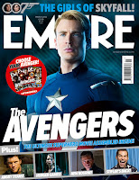
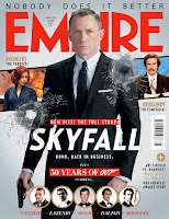
I next decided to add a stamp and arrow on to my poster, giving there even more to look at, taking inspiration from these magazine front covers


I first used the shape tool to create a circle and filled it the same red I used for my magazine title


I first used the shape tool to create a circle and filled it the same red I used for my magazine title

I then added a text layer using the same font I used for my magazine tagline

Next I added a larger black circle behind the red circle

Finally I added a second, larger again red circle behind the other circles to give the effect of their being two rings around the stamps

I grouped all of the stamp layers together so they could be easily moved around
Next onto the arrow, I first used the shape tool to draw a rectangle on the left hand side and filled it the same red as my stamp and magazine title
I next downloaded some photoshop arrow shapes to allow me to create the tip of the arrow

I then drew in the tip of the arrow using one of the downloaded shapes and filled it the same red
Lastly I filled in the text, using the same font as the tagline and stamp
Here is the full magazine with the added stamp and arrow

EB
Magazine Fifth Draft - Film Title
I now decided to add the title of the film to the magazine front cover
I copied in the film title that I had used in my poster as it was in the same font as we used in the trailer and it already had the red letters on a separate layer and filled the correct colour

I then converted this group into a single smart object and duplicated it till there were four copies and cropped each copy so it contained a different one of the four words, leaving me with four separate layers that I could move around individually

I then moved and resized each of the words

To further the effect that the words themselves were falling down I decided to split the word down into four separate smart objects for each letter using the same method as above

I moved each letter to where I thought they looked best
Lastly I added another piece of text in the same font I used for the tagline to use the convention of the magazine poster of using famous actor names to draw attention

I finally filled a word the same red as I used in the magazine title and tagline

EB
Magazine Fourth Draft - Secondary Articles Bar
I next created a bar of secondary articles taking inspiration again from several Empire magazine articles such as those below

I first used the shape tool to create the bar


I then added a text layer to say "PLUS!" to tell the viewer this is a selection of extra articles

I then grouped all of the layers that made up the base of the strip

I took two photos for for my strip, and got the other from a screenshot from my film, here are the images

I wanted to create the effect that the heads of each person were coming out of the bar, to achieve this I duplicated each photo for a top and bottom layer
For the bottom of each I cropped the top of the image off

For the top of each I used the magic lasso tool to remove the background

Here you can see both together with the top of the image placed on top

I placed a black bar between the layers to give the effect I wanted


Here is the images with the base of the bar visible again

I then added on space for the text for each secondary article

Lastly I added the text, creating a text layer for each article

I grouped the text and background of each article together so they could be moved around easily

Here is the finished strip

EB
Saturday, 16 December 2017
Magazine Third Draft - Magazine Title and Tagline
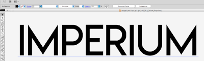
To give the font for the title of my magazine a unique feel I decided to create it myself using Adobe Illustrator
For a basis to work off I wrote out the name of my magazine in 'Lemon Milk' font which was similar to what I wanted the final font to look like
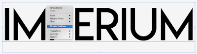
I first right clicked on the text and selected 'Create Outlines' to allow me to move around all of the corners individually
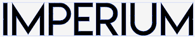
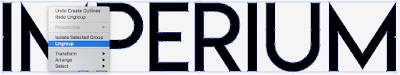
I then ungrouped the word to allow each letter to be moved around individually
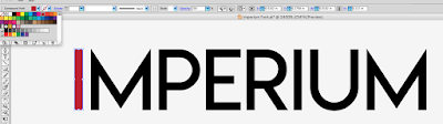
I then selected both of the I's and coloured them red to make them stand out and meet the conventions of the thriller
After this I decided to connect both of the I's to the next letter to make my font more unique and therefore stand out from other magazines
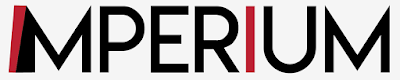
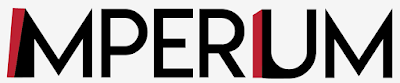
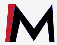
I then widened each of the M's so they weren't going straight down
I wanted more of the line below the P and in order to achieve this and keep the round shape at the top I first extended the line downwards
The I squashed the whole letter to be smaller
Lastly I dragged out the right hand side of the top of the P so it met the E
I then decided to flatten the top corners across the whole word, see below the before and after for the M and E.
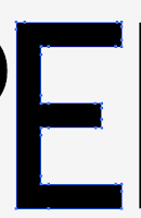
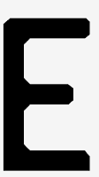
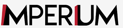
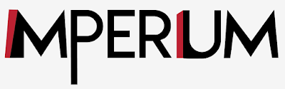
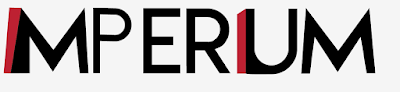
See below the final word
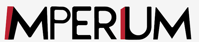
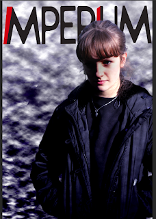
Here I have put it on my magazine front cover
Lastly I added a tag line for my magazine above the title saying "Behind the headlines, behind the scenes"

To make it stand out and match the magazine title I places two of the words in red
EB
For a basis to work off I wrote out the name of my magazine in 'Lemon Milk' font which was similar to what I wanted the final font to look like

I first right clicked on the text and selected 'Create Outlines' to allow me to move around all of the corners individually


I then ungrouped the word to allow each letter to be moved around individually

I then selected both of the I's and coloured them red to make them stand out and meet the conventions of the thriller

After this I decided to connect both of the I's to the next letter to make my font more unique and therefore stand out from other magazines


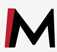
I then widened each of the M's so they weren't going straight down

I wanted more of the line below the P and in order to achieve this and keep the round shape at the top I first extended the line downwards

The I squashed the whole letter to be smaller

Lastly I dragged out the right hand side of the top of the P so it met the E

I then decided to flatten the top corners across the whole word, see below the before and after for the M and E.


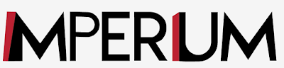
See below the final word

Here I have put it on my magazine front cover

Lastly I added a tag line for my magazine above the title saying "Behind the headlines, behind the scenes"

To make it stand out and match the magazine title I places two of the words in red

EB
Subscribe to:
Posts (Atom)