Showing posts with label Poster. Show all posts

Saturday, 16 December 2017

Poster Sixth Draft - Title and Billing Block

To add the final touches of my poster I added on the title and the billing block to make it match the conventions of the film poster

I took the billing block from our trailer and modified it to be longer and fit on three lines so it would slot into the width of my poster well


I then copied the modified billing block into my poster


I next copied in the title, using the same font that we created to use at the end of the film trailer


I used the magic lasso tool to select the same letters that were red in the film trailer and then created a separate layer for them to allow me to edit them without changing the white letters, and filled them red


To make the title stand out better against the back drop I added a drop shadow onto it all


I then experimented with different effects on the red letters to put extra emphasis on them, such as a stain and a cracked effect which can be seen below


In the end I decided to leave the red letters without an effect as felt this is how they looked best

This meant my poster was now finished


EB


Poster Fifth Draft - Critic Reviews

I surrounded the two main actors in critic review quotes, some that I came up with and some from audience feedback on my film.

I then created a fake magazine for each review to be from and put the title of it under each review along with the name pf a reporter


EB

Wednesday, 13 December 2017

Poster Fourth Draft - Film Festivals

I next wanted to give the effect that my film was critically acclaimed so I decided to create my own film festival logos. I took inspiration in the sort of film festival logos I wanted and where to place then from the posters below.


I first found an image of film festival laurels to download


I then used the Photoshops select highlights feature to delete the background and then inverted it to give the white colour to match the rest of the poster


See below another type of film festival logo I made, though I decided it would look better if each of the festival logos were uniform


I then copied the film laurells into my poster and added a text layer to fill in the film festival information


I then copied this twice, editing the text layer in each giving my film awards from three different Film Festivals I created. I used groups to make hidding and moving the logos around easier. I grouped each Film Festival and groued them all together.


EB


Tuesday, 12 December 2017

Poster Third Draft - Adding the Tear

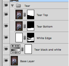
Here is how I created the torn paper effect to convey Eve's split personality and to hint that the seemingly normal at first poster is not all that it seems

First I found some torn paper brushes on the internet to download to give the effect that I wanted


I then duplicated the background layer and added a layer mask


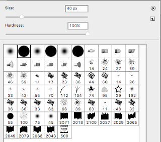
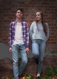
With the layer mask selected I used the paint brush tool with the torn brushes I had downloaded to create a rip across the background


I then hid this layer and repeated the same process again to create the bottom half of the rip


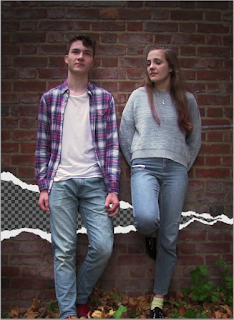
See below what they both look like together


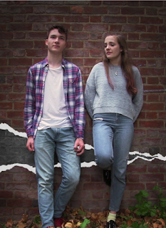
Next to make the tear more realistic I added a white outline. To do this I created a new layer which I filled white and added a layer mask again. This time I cut out the centre of the tear leaving a border at each of the edges to give the white effect at the edge of the rip.


Lastly I added and Hue/ Saturation layer and turned the saturation down to 0, leaving the original base layer below the tear, making behind the tear appear to be in black and white


EB


Saturday, 9 December 2017

Poster Second Draft - Adding the Tree

I next added a dead tree behind the two actors, I took inspiration for this from a shot in Killing of a Sacred Deer, one of my similar media texts (see screenshot below). I wanted to use this idea but instead of having it represent life to have it represent death.


I first used the magic lasso tool to cut out the two actors from the background to allow me to place them infant of the tree, to add some division between them and the death


I next found an image on google for a dead tree and used Adobe Photoshops built in 'select highlighs/lowlights' feature to quickly cut out the tree from it's surroundings. I then inverted the tree as white fitted better with the colour scheme of my poster and would stand out better against the wall.


I then placed the two actors infant of the tree


Lastly I tried several different blending modes to get the tree to blend into the background smoothly, in the end I decided on 'Overlay' as it gave the effect of the tree disappearing into the background that I wanted.


EB

Friday, 8 December 2017

Poster First Draft - Preparing the Background Image

Here is the first stage of the construction of my poster.

I first used VLC media player's snapshot feature to get a screenshot I liked from out footage. I would have taken the photo separately like I did for my magazine front cover but the actors had other commitments


I then opened the JPEG file in Adobe Photoshop and resized the image to the correct dimensions for my poster, deciding I wanted a portrait poster as it would mean the two actors took up the majority of the poster


Next I began the colour correct, first I adjusted the colour to make the image seem less flat by increasing the saturation and adding a slight orange tint


I then increased the brightness and the contrast to again make the image less flat and more representative of a real poster


Lastly I added a vignette around the actors to help them stand out from the background. To make sure it was their faces a viewers attention was drawn to I used to circular vignettes one around their whole bodies and one just on their upper halves


EB

Monday, 11 September 2017

Conventions of the Film Poster

After my research into several film posters in the horror/ psychological thriller genre there can be many clear conventions seen across most, if not all of them
  • Colour Scheme - Nearly always in just the three colours white, black and red because of its connotations with blood, danger and passion
  • Title - Usually placed in the bottom third of poster in the largest font of any test on the poster to draw your eyes. It is nearly always in red to make it stand out though sometimes, such as in the poster for Awake, white on a black background is used
  • Key Actors - Their names are normally found in the second largest text to bring a guaranteed audience to the film
  • Background Image - One image will take up the whole background, frequently showing a close up of one of the stars of the film
  • Release Date - This will be likely at he bottom of the poster and highlighted in some way, whether that be red or slightly larger
  • Memorable Slogan - Where this is varies but usually in the top two thirds of the poster there will be catchy 3/4 word slogan to sum up the film in an easy to remember fashion
EB

Tuesday, 22 August 2017

Poster Research - Awake


EB

Poster Research - Inception

  • Large contrast in colours between red text and dark blue background, (complementary colours). This draws the audiences attention straight away to the memorable, one word title, making certain it will stick in peoples head
  • We see the main actors name highlighted at the top of the poster as Leonardo Dicaprio will bring a guaranteed audience to the film just from being in it as he is already well known for acting in thrillers/ sci-fi's
  • The location us made clear as being very urban, seen from the huge skyscrapers behind the people.
  • The genre of thriller is reinforced again my the gun that can be seen being held by the man standing at the front
  • The light is focused on this man, highlighting him as the protagonist of the film
  • The deserted road apart from the six people creates and eerie feel and an almost post apocalyptic feel.
  • It is unclear to an audience whether these people are 'good' or 'bad', creating intrigue., though from the suits they are dressed in we can see they are reasonably well off and there seems to be some togetherness and unity between them.
EB

Poster Research - Shutter Island


EB