For a basis to work off I wrote out the name of my magazine in 'Lemon Milk' font which was similar to what I wanted the final font to look like

I first right clicked on the text and selected 'Create Outlines' to allow me to move around all of the corners individually


I then ungrouped the word to allow each letter to be moved around individually

I then selected both of the I's and coloured them red to make them stand out and meet the conventions of the thriller

After this I decided to connect both of the I's to the next letter to make my font more unique and therefore stand out from other magazines


I then widened each of the M's so they weren't going straight down

I wanted more of the line below the P and in order to achieve this and keep the round shape at the top I first extended the line downwards

The I squashed the whole letter to be smaller

Lastly I dragged out the right hand side of the top of the P so it met the E

I then decided to flatten the top corners across the whole word, see below the before and after for the M and E.
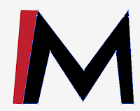



See below the final word

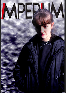
Here I have put it on my magazine front cover
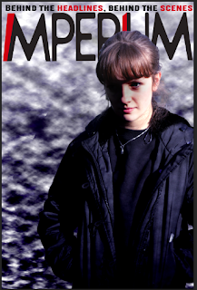
Lastly I added a tag line for my magazine above the title saying "Behind the headlines, behind the scenes"

To make it stand out and match the magazine title I places two of the words in red
EB
No comments:
Post a Comment